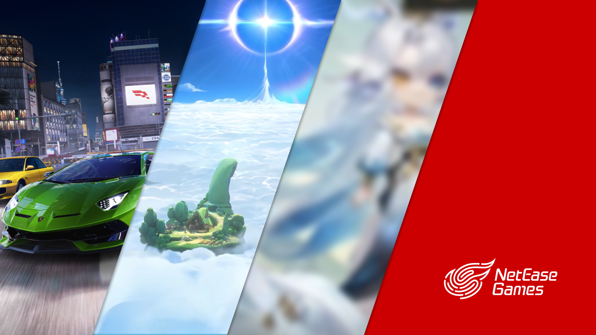
Three projects · Three design problems
Project overview
 01
01Live · 35M+ MAU at product level
Racing Master
Turn a year-end report into a player story worth sharing.
Jump to project ↓ 02
02Public Beta
Beneath the Mist
Make build state and rescue choices readable under pressure.
Jump to project ↓ 03
03Pre-launch
Popular IP Spinoff
Make the first placement and repeat action easier to learn and perform.
Jump to project ↓01Live · 35M+ MAU at product level
Racing Master
Product judgment · Challenging and reshaping the brief
Year-end review
From a year-end report to a player story worth sharing.
The brief asked for a year-end recap. I created the requested flow, but saw that reporting progress alone offered limited emotional payoff or motivation to share.
I then proposed and prototyped an alternative centered on player connection and social sharing.
Report the year
Useful information, but little reason to care after the recap ends.
- 01Season dataWhat happened
- 02Performance summaryHow the player did
- 03CompletionThe experience stops
PayoffInformation consumed
Add personal meaning and a social destination—not more statistics.
Make the year feel personal
Use the recap to build recognition, emotional connection, and a shareable ending.
- 01Personal momentsRecognize the player
- 02Emotional arcBuild connection
- 03Shareable endingGive the story somewhere to go
PayoffAlternative adopted · Shipped
Interpreted the brief, produced both prototypes, and proposed the alternative direction.
Alternative adopted by Game Design and key stakeholders · Shipped
02Public Beta
Beneath the Mist
Information design under pressure
Two moments required the same thing from different systems: bring the information needed for the next decision into one readable view.
Decision 01 · Build progression
Show the build roadmap where equipment choices are made.
- Why it broke
- Equipment choices contributed to a larger build, but players could not easily see which abilities were active or how close the next activation was.
- What changed
- Placed a compact roadmap at the top of the ability list, showing current values, active abilities, and upcoming activation thresholds in the same view as the equipment decision.
- Ability AActive61 / 35
- Ability BNext threshold20 / 40
- Ability CBuilding24 / 36
Current state and next thresholds stay visible in the same decision context.
Compare the next item against the whole build—not an isolated stat.
Resulting behaviorPlayers can see what is active, what unlocks next, and how the current choice advances the build before committing.
Decision 02 · Rescue decision
Let a downed player compare time left with help arriving.
- Why it broke
- After calling for help, a downed player could not tell whether nearby teammates would arrive in time—leading to premature surrender or long, uncertain waiting.
- What changed
- After teammates confirmed the rescue, the system generated the best route and placed rescue-travel progress directly beneath the death countdown for an immediate comparison.
- 01Call for rescue
The downed player needs more than an unanswered signal.
- 02Teammates confirm
Confirmation turns uncertainty into a concrete rescue attempt.
- 03Compare in one place
If the route can finish first, waiting becomes an informed choice.
Resulting behaviorThe downed player can judge whether help is likely to arrive before the death countdown expires.
03Pre-launch
Popular IP (Onmyoji/阴阳师) Spinoff
Learning and repeated interaction
The first interaction needed to teach strategy; a repeated interaction needed to disappear into muscle memory. Both were designed directly in the context of play.
Decision 01 · First placement
Translate a unit trait into a recommended board position.
- Why it broke
- Players new to the game did not yet understand character traits, so they could not tell whether a piece belonged in the front or back row.
- What changed
- Connected each unit’s role to an in-board recommended range and a reusable front/back placement cue at the moment of deployment.
Role is translated into a reusable placement cue.
Targets mark representative front-line positions; the shaded cells show attack reach from the selected example.
Resulting behaviorPlayers can understand where this type of unit belongs before placing it, without leaving the board to learn the rule.
Decision 02 · Repeat action
Deploy an action with one uninterrupted touch.
- Why it broke
- A comparable interaction required opening a menu, choosing an animation, and closing the menu before returning to play.
- What changed
- Proposed a press-drag-release gesture that consolidated the three commands into one continuous touch, then followed its motion and text timing through implementation.
- 1Open animation menu
- 2Choose animation
- 3Close menu
One uninterrupted gesturePress · drag · release
Resulting behaviorThe player keeps one finger on-screen, drags to an action, and releases to deploy it without breaking the flow of play.
Implementation
Followed behavior through implementation.
Prototypes made behavior inspectable across Game Design, GUI, and engineering. I stayed involved through implementation, including motion and text-transition timing, so the final behavior preserved the design intent.
Intent → Prototype → Implementation review → Final behavior
What this work demonstrates
Three kinds of design evidence.
- Product direction
- Challenge and reshape a brief when the requested experience is not strong enough.
- Information design
- Make complex state and time-sensitive decisions legible in context.
- Interaction craft
- Reduce repeated effort and follow behavior through implementation.